Guidelines For Deciding On The Right Type Of Logo For Your Business
May 1, 2023

What is a Logo?
A logo is a graphic symbol or icon used to represent your business. It is what people see when they think of your company, and it helps them remember who you are.
A good logo should be memorable, unique and relevant to your brand. It should also be simple enough to be easily reproduced in various formats (e.g., on social media). The best logos use colour effectively while still being recognizable even in black-and-white mode.
Factors to Consider When Choosing a Logo
When you're deciding on a logo, there are several factors to consider:
First, who is your audience? If you're creating a logo for a children's clothing store, then it will be important that the design appeals to both kids and parents. A simple and colourful design may work best for this audience.
Another important thing to consider is style--what kind of look do you want for your brand? Do you want something modern or traditional? Will the style match what people expect from companies in your industry? You might also want to consider the colour palette: do certain colours represent your brand better than others? For example, many brands choose green because it represents nature; however, if yours is an urban restaurant then red might be more appropriate because cities have lots of traffic lights!
Finally, keep scalability in mind when choosing a logo--you don't want something so detailed that it doesn't translate well at smaller sizes on websites or social media platforms where space constraints exist!
Types of Logos
-
Wordmarks
-
Pictorial marks
-
Abstract logos
-
Combination marks (combining words and pictures)
-
Mascots
-
Letters and initials
1. Wordmarks
A wordmark is a logo that uses words to convey the company's identity. It can be a single word or an acronym, but it must be memorable enough to stand on its own without any additional graphics. Wordmarks are often used when the company name is already well known and doesn't need any explanation.
Wordmarks are easy to understand and remember, which makes them ideal for businesses looking for a strong brand identity that requires little thought from customers. They're also great for companies with multiple locations or products because they allow each location or product line to have its own unique name without diluting the overall brand image (for example Coca-Cola and Google). However, they don't work well if you want people who aren't already familiar with your business name. In that case, you'll need another type of logo!
-
Pictorial Marks
Pictorial marks are logos that use an image to represent the company, such as a logo with a picture of a product or service. Examples include:
-
The Apple logo, which shows an apple with a bite taken out of it
-
The Twitter logo has a silhouette of the Twitter bird in blue color.
-
Abstract Logos
Abstract logos are a type of logo that uses abstract shapes and lines to create a visually pleasing design. Abstract logos are often used by companies that want to convey an image of sophistication, creativity and innovation. A good example of this type of logo is the icon logo of Pepsi Globe. The combination of red, white, and dark blue inside a spherical shape looks incredibly appealing due to the “smile” effect, created by the white swirl inside the sphere. Another example could be the Nike logo. In Greek mythology, Nike is the Winged Goddess of Victory. The logo is derived from the goddess' wing, ‘swoosh’, which symbolizes the sound of speed, movement, power and motivation.
-
Combination Marks
Combination marks are logos that use two or more words to create a single visual. They're often used when you want your logo to represent multiple aspects of your brand, such as the name and tagline, but they can also be used in other situations.
Examples include:
-
Burger King’s logo has bold and smooth Burger King lettering replacing a burger between two orange buns.
-
The present logo of Dove - a cosmetic brand has a silhouette of a dove in golden colour with subtle Dove lettering.
-
Mascots
A mascot is a character or symbol that represents a brand. It can be an animal, person, or object (like a tree). Mascots are used to create interest in your business and help you stand out from competitors.
Here are some examples of mascots:
-
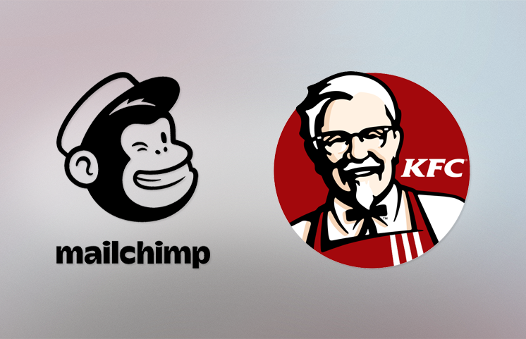
The present logo of MailChimp has a face of a chimpanzee named Freddie giving a mischievous wink and MailChimp written below it.
-
The logo of KFC depicts the portrait of the founder of the brand, Colonel Sanders accompanied by bold KFC lettering and a timeless and powerful colour palette, composed of red, black, and white.
-
Letters and Initials
Letters and initials are a great way to create a memorable logo. They're also easy to read, which makes them ideal for small businesses that need a simple, clean design. Letters can be used as stand-alone symbols or part of your company name. For example, if you're named "John's Pizza," you could use an image of a slice of pizza with the letter J inside it as your logo--or just use the word "John's." Letters can also be placed together in various arrangements to form new words that represent what your brand stands for. For instance, if you run an architecture firm called "Architectural Designs Incorporated," then ADI might make sense as part of your logo (and could even be incorporated into other aspects of the design).
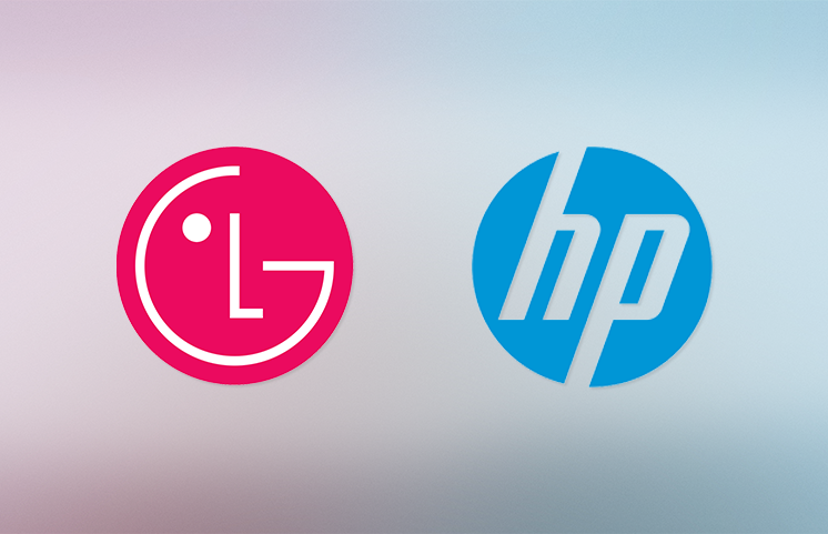
Initials are another option worth considering when choosing how best to represent yourself visually through letters or combinations thereof; they work well when paired with other elements such as icons or images related directly back to what makes up who YOU are as an individual or company. Examples of this kind of logo could be HP and LG brand logos.
In conclusion, a logo is an integral part of your business. It's how people recognize you and can be used as a branding tool. A good logo should be simple, unique and memorable. There are many different types of symbols that can fit different businesses depending on their needs and budget. The most important thing to remember when creating or choosing a logo is that it must represent who you are as a company!


