How To Make Your Website Better with Responsive Design
May 24, 2023
In recent years, the use of smartphones and other mobile devices has skyrocketed, with more people than ever before choosing to use their phones instead of their laptops or desktops. In 2023, the number of smartphone users in the world today is 6.92 Billion, which translates to 86.29% of the world's population owning a smartphone. In addition, a survey conducted by Pew Research Center found that 37% of Americans now use smartphones as their primary means of accessing the internet, compared to just 19% who primarily use laptops or desktops. Due to the growing importance of mobile devices in our daily lives, businesses and marketers must adapt their strategies to reach consumers on the platforms they use most frequently and create responsive websites and apps.

Having responsive websites and apps ensures that their online presence is accessible and user-friendly across all devices, including smartphones and tablets. With more people using mobile devices to access the internet, having a website or app that can adapt to different screen sizes and resolutions is crucial for providing a seamless user experience. In addition, responsive design can also improve a website's search engine rankings and increase its visibility, helping businesses to attract and retain more customers in today's highly competitive digital landscape.
With this blog, we will help you know how you can make your websites and apps better and look functional with responsive design. Let’s begin with understanding what a responsive design is.
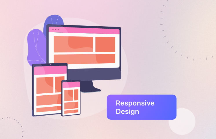
What is Responsive Design?
Responsive Design is a technique that allows websites to adapt to any screen size, from desktop computers to smartphones. It's an essential part of creating a good user experience on your website because it allows you to optimize your content for each device type without having to create separate pages for each one. Instead of using multiple templates for different devices, responsive design uses CSS3 media queries along with fluid grids and flexible images so you only have one template that changes based on device size instead of multiple ones!
How to Implement Responsive Design?
To implement responsive design, you need to choose the right framework. There are many frameworks available for free online, but they vary in terms of quality and performance. Some are better than others and some have more features than others. It's important that you choose one that will work well with your particular project needs so that it doesn't become an obstacle later down the road when it comes time to make additional changes or updates.
A good place to start looking is at Bootstrap 4 - one of the most popular responsive frameworks available today because it's easy to use while still being powerful enough for advanced users who want more control over their websites' appearance and functionality (such as adding custom CSS).
Tips for Making Your Website Responsive
-
Incorporate flexible images.
-
Use media queries.
-
Consider your navigation.
Best Practices for Responsive Design
-
Make Your Content Readable
Responsive design is not just about making a website look good on mobile devices. It's about making sure that people can easily read, understand and interact with the content on your site. This means using fonts that are large enough to be seen clearly from a distance and avoiding long lines of text or paragraphs that run off the screen when viewed on smaller devices.
-
Test Your Site Across Different Devices
It's important to test your site across different devices so you know how it will look for users who access it from their phones or tablets (or even desktop computers). You should also consider testing different browsers and operating systems as well as screen resolutions since these can affect how well your site displays in various browsers across different platforms.
Examples of Responsive Design
-
Bootstrap
-
Foundation
-
Skeleton
The Future of Responsive Design
The future of responsive design is adapting to your users' needs.
For example, you could use adaptive design to change the look of your website based on what device they're using. For example, if someone visits your site on an iPhone and then switches over to their tablet or laptop later in the day, their experience would be different than if they had only been using one device all along--and it could even include ads tailored to each screen size!
Adaptive Ads are another way that Responsive Design will continue evolving in order for businesses like yours to stay competitive online as more people become accustomed to these technologies every day.
Also, remember to
Measure the Success of Your Responsive Design by -
- Analyzing your site performance at regular intervals
- Monitoring your user engagement
- Tracking conversion rates
Responsive design is a powerful tool that can help you to create a better user experience for your website visitors. It's important to remember that the benefits of responsive design are not limited solely to those who visit your site on mobile devices. Responsive websites are also easier for search engines and other bots (such as Googlebot) to crawl and index, which means they will get higher rankings in SERPs than non-responsive sites.

We create a strong web presence for businesses with our creative development, designing, and branding solutions.


