Kala Tribe
Kala Tribe was conceptualized to introduce the urban population to the traditional art forms, often found in the lost lanes of India. The company wanted us to create a logo to represent its brand and its traditional values with a hint of modern touch. Our goal with this project was to design a logo for the company that could present the brand’s strong, traditional roots while keeping it trendy and simplistic.
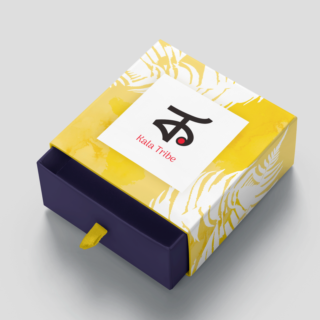
To achieve this goal, we first had to understand the client's requirements, the nature of their brand, values, objectives, the company's traditional values and target audience. According to the requirements, we came up with a few combinations for the logo, font, and color scheme and presented them to the client. From which the client chose one. We worked on the designs finalized by the clients, made some final edits and delivered the final draft to the client. Overall it took around two weeks for this entire process. We were happy with the client's reaction to it! We decided on merging the letter “K” in Bengali and the letter “T” in English and designed different combinations out of it to form a logo for Kala Tribe. You can see in the images above that the colors we used for the logo are red and white, where the main shape is white with a small red circle that appears like a bindi. The small red circle is inspired by a Bengali saree. The upward tick on the T (stands for the tribe) makes it looks like it’s progressing upwards while keeping the (red) roots grounded. We have a few images of the mockups for you to have a look at how the logo looks on the business card, letterhead, and other merchandise.
- Project Name:Kala Tribe
- Client:Kala Tribe
- Finshing Date:June 2, 2022
- Duration:2 Weeks
- Category:Design

Find out how we’ll build your digital presence
Don’t miss out the potential visitors and sales for the absence of your digital presence.
Get Started
We create a strong web presence for businesses with our creative development, designing, and branding solutions.


