Tiryañc
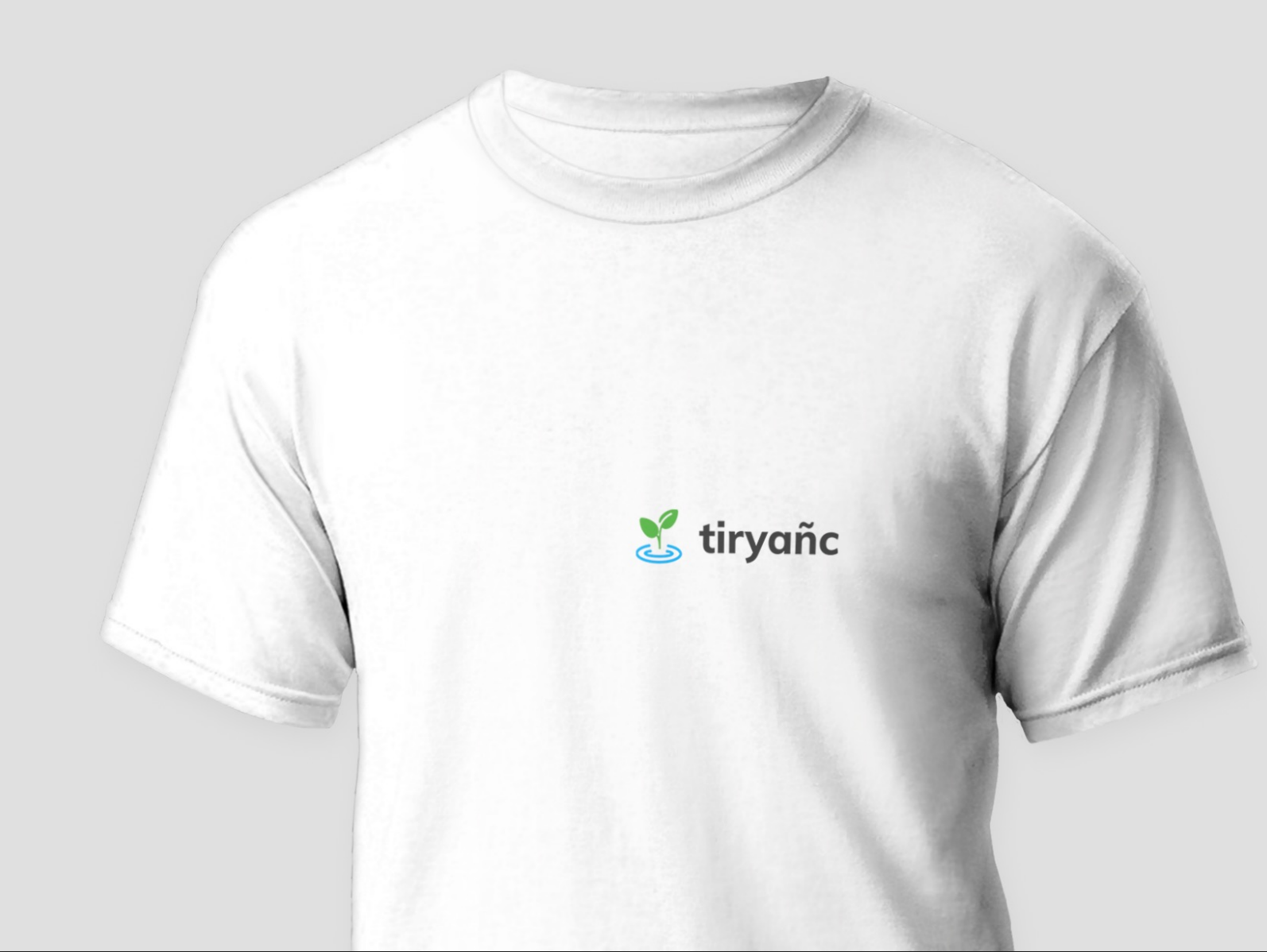
Tiryañc farms are into growing spices and herbs using hydroponic methods. Hydroponics is a way to skip the soil, sub in a different material to support the roots of the plant, and grow crops directly in nutrient-rich water. It is a revolutionary concept that allows farmers to produce food anywhere in the world at any time of the year and to net higher yields with fewer resources. Our goal with this project was to design a logo for them that could portray the brand's core idea.
To make the brand recognizable and fulfill the objective of the client, we first had to understand the client's requirements, the nature of their brand, values, objectives, the company's traditional values and target audience. According to the requirements, we came up with a few combinations for the logo, font, and color scheme and presented them to the client. From which the client chose one. We worked on the designs finalized by the clients, made some final edits and delivered the final draft to the client. Overall it took around two weeks for this entire process. We were happy with the client's reaction to it! We kept the look of the logo simple, bright and neat. For the main structure, we designed an illustration of a plant growing in the water with the brand name alongside to symbolize that the company uses hydroponics to grow plants and herbs. We used green color (#6cbd4b) for the plant, blue color (#37b2e4) for water, and dark grey (#4c4c4c) for the brand name. Now, for the font, we used Multi Extrabold. You can get a preview of the logo, a few variations of the design and how it looks on the business card, letterhead and merchandise in the images and videos displayed above.
- Project Name:Tiryañc
- Client:Tiryañc
- Finshing Date:June 2, 2022
- Duration:2 Weeks
- Category:Design
Find out how we’ll build your digital presence
Don’t miss out the potential visitors and sales for the absence of your digital presence.
Get Started


